Tuesday, June 28, 2016

EXPERIMENT THREE: THE BRIDGE

The Bridge

1. THE MASHUP OF THREE NEWS ARTICLES
mashup
2. THE 18 SKETCH PERSPECTIVES
one point | two point 
3. THE 36 CUSTOM TEXTURES
textures
4. THE MOVING ELEMENTS
moving elements
5. THE IMAGE CAPTURES AND ARCHITECTURE
drafts | final
lumion download


DEVELOPED LUMION ENVIRONMENT


Unfortunately I cannot edit the glass texture in Lumion without the entire model turning black every time. I have tried everything but it seems I can only have my textures show up or the glass be clear so I have included images of the textures without the clear glass.
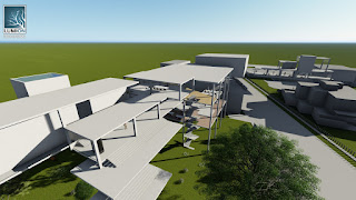
The bridge explores the idea of using alternate building materials than what is typically expected. In my model, I have used glass in order to incorporate the elements of the Farnsworth house. 
The natural light is able to brighten the feeling of a dull building and create an atmosphere within. As an engineering school, the classic columns and cubic style are suitably themed. 

Open plan library offering meeting rooms for students and study space 

Textured library floor

The library spans several floors and connects the bridge to the ground plane
Looking out towards the UNSW campus, where the bridge begins

Faculty offices and walkway stretching across Anzac parade
Textured walls

Light filled studio room
Textured walls of the studios

A walkthrough featuring the moving elements:


DRAFT LUMION ENVIRONMENTS


 Draft 1: Inspired by Farnsworth House 


Draft 2:

MOVING ELEMENTS

1. Bridge for circulation


2. Sun shade for privacy


Wednesday, June 1, 2016

Textures


original version

Progress


things to work on:
- bridge in context
- bridge aspects vs just an elevated building
- needs further development
- work on the spaces
- moving elements

Tuesday, May 24, 2016

Week 3

Farnsworth House
- Glass/concrete use
- Undefined spaces
- Simple form

Developed model: